“At the moment of truth, there are either reasons or results.” – Chuck Yeager
It is hard to believe that it has been ten months since Team Rubicon, inspired by the incredible generosity of donors across the country who invested in the responding to Harvey, released the first iteration of our open initiative when we published an “Invitation to Explore Our Data”. Our goal was to provide access to the inputs, investments, expenses, donations, and ultimately the impacts that would inform our donors, volunteers, fellow non-profits – basically anyone who cared about our mission – accuracy and timeliness in sharing our data would core components of our strategy. The open initiative would also serve to bolster adherence to our service principles of Accountability and Innovation.
Three months after we released our first version of the open initiative, Corey Eide wrote “Show Me the Value”. He introduced the key performance indicator of “value”. Thanks to one of our partners, Team Rubicon was able to utilize Xactimate in order to determine the retail value of assistance provided during Harvey. The retail value of assistance provided by Team Rubicon in the wake of Hurricane Harvey was estimated at $6.72 million.

The journey of “building the plane as you fly it” has been amazing and with the help of a lot of crowdsourced pilots, mechanics, and engineers, Team Rubicon is happy to announce the release of version three of our open initiative. I believe we’re out of the dive, in level and steady flight, and thanks to inputs from across the community, we’re ready to climb. So what have all of the contributors helped us to learn as we power up and strive to fly higher?
- Continue to remain committed to being open with Team Rubicon’s stakeholders. Our stakeholders recognize nothing is perfect and transparency with the good and bad leads to collaboration, trust, and continual improvement.
- Continual improvement is a team sport. There is always a bias and the ability to have people explore and challenge the story that the data does (or doesn’t tell) is a way to expose and sieze opportunity. This approach helps to avoid problems and enable sharing of lessons learned.
- Perfection remains the enemy of progress. Stakeholders have helped us in encouraging us to be daring (but never careless or intentionally misleading) in sharing our data. Be comfortable with sharing the data that has been collected but continually refine that data with perfection the desired endstate.
- A picture is worth a thousand words, and the ability to add to the picture adds another thousand words. Our stakeholders have responded very positively to the iterations that Qlik has presented and many asked about the ability to dive deeper into each of the open initiative panels to uncover the details behind the KPIs. We were told that uncovering the hidden questions was the hidden map that would take us to the hidden treasure of greater understanding.
With these modifications, additions, and a bigger and better data engine in place, what does the new airplane look like? Hopefully, it looks sleeker and faster, and perhaps like something that tells a story, then invites you to explore the storylines. Version 3 of our transparency initiative begins with an exploration of the upper left table of contents. The hierarchy is intentionally tiered to allow you to dive deeper and deeper into the details, but to always have the ability to “reset” your exploration storyline.
Team Rubicon will be releasing a series of blogs in the near future to point out some of the finer details of our newest machine, but I’d invite and encourage you to check it out. Don’t worry – you won’t break a thing as the data, while updated on a regular basis, is safe from the “cell-changer” in all of us. You won’t cause it to crash.
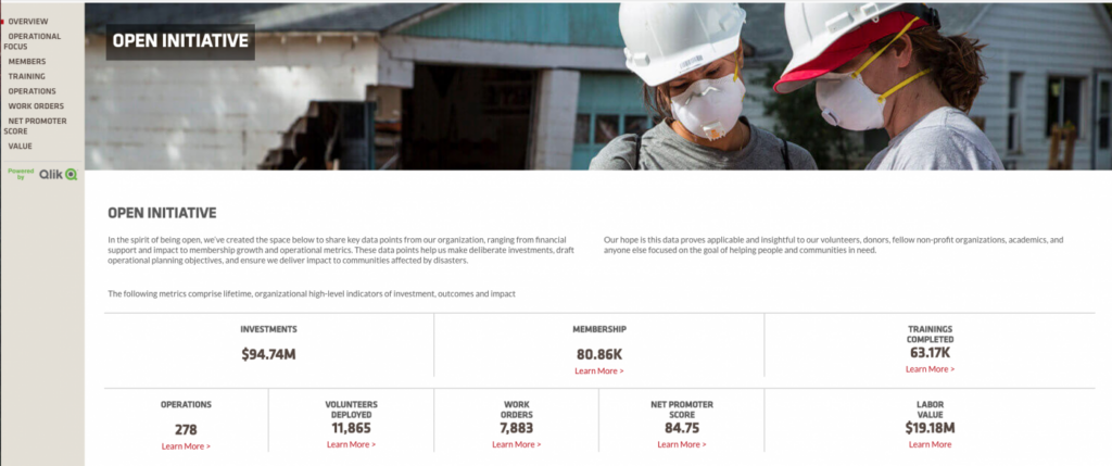
So where should you start? I would recommend that you begin with the “Overview”. As you scroll “below the fold” you will see short descriptions of each of the six sub-chapters. From there, click on “Learn More” to show the various data fields that underlie each of the graphics. Clicking on any of the data fields narrows the scope of each dataset and you’ll see that reflected in the changes in the data fields. If you’re like me, you’ll also be happy to know that you can get back to your starting point by clicking on the “CLEAR SELECTIONS” icon that appears under the contents banner.
Next, please consider checking out our two newest TR destinations. In the wake of Harvey and Maria, TR made a decision to launch rebuilding as a new capability in both Houston and Puerto Rico. Each of these efforts has allowed us to make intentional decisions in how we will predict, measure, and refine the investments, costs, and outcomes to scale our impact. It has been an amazing journey!
As you do this, you’ll see what’s outside the windows and be able to jet to different events, places, and inputs. You’ll find it is also a time machine. Want to jump and see only the operations conducting in 2014? No problem. Curious about the number of volunteers that joined in 2017? No problem. The machine will do a lot – grab the controls and do a roll, pitch it up, or throw it in a dive.
The only thing we ask is that you let us know what you think. Don’t be afraid to hit the assistance button above your head to ask the next question, and by all means, let us know what would make your trip more enjoyable!
And finally, thanks! We know there are a lot of other datasets you could choose to fly and appreciate your choice to continue to fly the TR skies!