In the world of disaster relief, few logos are as recognizable as Team Rubicon’s cross-and-river emblem. Adorned on grey t-shirts worn by volunteers across disaster zones worldwide, and tattooed on the flesh of hundreds of those same volunteers, the symbol has become synonymous with hope and help in the darkest hours. Behind the brand, though, is a sibling story: That of Team Rubicon founder Jake Wood and his talented artist sister, Sarah Wood Lenger.
From Childhood Rivals to Creative Collaborators
“I used to call him ‘Jeebub’ because I couldn’t pronounce Jacob,” says Sarah Wood Lenger, the older of the two siblings. “He called me ‘Sah-wah’ because he couldn’t pronounce his R’s.” To wit, sometimes, to her chagrin, Jake still calls her Sah-wah in meetings, today.
Amicable childhood playmates, the siblings’ relationship had changed a bit by the teen years.
“We did not like each other at all in high school,” attests Sarah. Jake disagrees: “I think the disdain was one-directional,” drawing laughs from his sister.
Maybe that one-directional disdain came from differences in personality types. Jake, says Sarah, was the good kid; she was the party animal. Despite being the elder, Sarah says, “I had to make my own way in the world because Jake was the boy and the football player, so I chose the art-and-party direction.”
That division would later prove fortuitous, creating the perfect complementary skill sets for a life-changing collaboration.
The Birth of an Iconic Brand
In early 2010, Jake, a Marine Corps veteran who had just separated from the service, led a team of mostly veterans to Haiti in response to the devastating earthquake. While there, Jake dusted off a blog he had maintained while deployed in Iraq, primarily for the purpose of communicating back home with friends and family who were supporting the team and giving them a glimpse into what was going down in Haiti.
Sarah, then working as an art director and designer at the University of Iowa, took it upon herself to refresh Jake’s dormant blogger site, transforming it into a nascent Team Rubicon landing page.
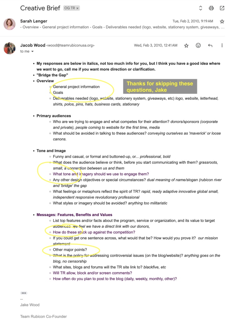
It wasn’t until after the Haiti mission, when Jake and the others had made a preliminary decision to continue Team Rubicon in some fashion, that the conversation around the creation of a brand and logo began. Starting with a creative brief.
“You know, I returned to Sarah the world’s worst creative brief,” says Jake, “and she gave back the world’s best logo.”
Jake’s not kidding about that brief.
The Evolution of the Grey Shirt
Sarah’s resulting logo: an aid cross of sorts flipped on its side—as if a disruption of the traditional model of humanitarian aid and disaster relief—with the Rubicon River snaking through it, would become an icon. The plain, grey, Under Armour shirts the team had donned en route to its second deployment—the earthquake in Chile—the first canvas for Sarah’s design.
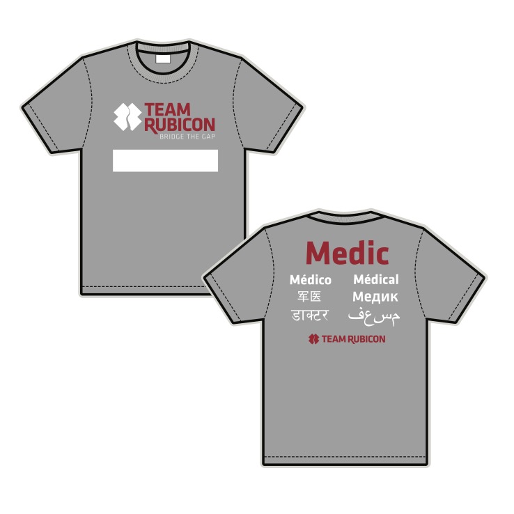
By August of 2010, the team was donning the first version of that logoed grey shirt as they headed to Southeast Asia to render aid after a series of natural disasters, including floods and landslides triggered by heavy monsoon rains, and Tropical Cyclone Giri, caused significant damage and casualties. The first printed versions featured Sarah’s logo on the front with “Team Rubicon” across the top of the back and “medic” written in six different languages below—albeit nearly with a small hiccup.
In Sarah’s initial design, the word “medic,” (طبيب) placed in an Arabic font, read left to right instead of right to left. Eyeing the design, a Baghdad-born screen printer said, “Ooh, this is interesting,” then pointed at the Arabic word and asked Jake what it was supposed to say. “Medic,” Jake replied. That, the screen printer informed him, wasn’t what it said. And so, he changed it for them.
If the logo was Sarah’s vision and inspiration, the distinctive white name bar running across the front of those grey shirts—now a hallmark of the Team Rubicon uniform—was Jake’s idea and drew inspiration from military uniforms. The simple addition also proved brilliant for disaster response, offering instant familiarity and authority when approaching homeowners in crisis situations.
A Timeless Design
Fifteen years later, both siblings are proud of how the logo has endured. “That’s the brilliance of it,” Jake says. “It hasn’t had to change.”
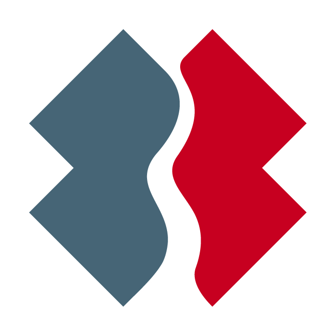
Sarah estimates she spent only about two hours on the original design, yet remains deeply satisfied with it. “That says a lot because you can spend months on a logo and still never be happy with it,” she reflects. Not so of the tilted cross with its river running through. “It’s simple and concise, it’s clear, it has meaning, it has a concept, and that’s all you really need in a logo.”
The design did undergo a refresh in 2023—despite Jake’s resistance.
“I thought it made the river look soft,” he says, laughing.
“You did use the word ‘flaccid’,” says Sarah. “You’re such a jerk.”
Eventually, the siblings reached a compromise. “It looks fantastic now. Now I love it even more,” Sarah says.
More Than Just Business
Working together has strengthened the Wood-siblings bond. When asked if collaborating with a sibling is difficult, Jake responds without hesitation: “Not at all. She’s talented and does great work… It’s been a blessing to our relationship.”
Sarah sees Team Rubicon as an extension of their family values. “When he built Team Rubicon, I think he built it in the image of our upbringing, our family, our values, and that’s why it’s so easy for me to work there,” she explains. “It’s a family to me because he made it just like our family.”
This family connection continues today with Sarah’s design studio, Lenger Design Studio, where she serves as owner and creative director, while Jake founded Groundswell after his time leading Team Rubicon.
A Brand Mark of Pride
Perhaps the most powerful testament to their creation is how many Team Rubicon volunteers have permanently inked the logo on their bodies—Sarah included. “It is an honor,” she says about seeing her work tattooed on so many people. “I never thought it would be possible.”
Both siblings recognize the profound meaning behind these permanent marks. “I’m honored that they love the organization so much to put it on their body, but they also love the mark so much that they can put it on their body,” Sarah reflects. “That says something about Jake’s organization, but also about my mark.”
With decades of siblingship under their belts, and 15 years since the creation of both Team Rubicon and the logo, the two remain tight—and big fans of each other.
“Part of me wants to say that I wish the rest of the world knew how talented a designer she is because not enough people know that,” says Jake of Sarah. “But for those that do already know that, I would say I wish people knew just how thoughtful and caring she is. She’s not just an amazing professional, she’s an amazing human being.”
For Sarah, the knowledge is a bit more intimate—in part because of Jake’s stature in the world.
“I think everyone knows that Jake’s an awesome human being, but I think everyone should know what an awesome brother he is,” says Sarah of her humanitarian sibling. “Everyone knows how awesome he is to the outside world, but he’s also a wonderful human being on the inside. It’s not all for show.”
From childhood nickname confusion to creating one of the most recognized humanitarian brands in the world, Jake Wood and Sarah Wood Lenger prove that sometimes, the best creative partnerships are forged in family.