
On the morning of Thursday, March 12, 2020, I headed to Team Rubicon Headquarters. As a graphic designer, I was ready to fire up my computer and hop into Adobe to begin creating our next social graphic, slide presentation, or web advertisement like I had every other day for the last seven months. I parked my car on the 6th floor, and with coffee in hand, I walked down, down, down, and jay-ran across Vicksburg Avenue to the office to beat the rain that was beginning to fall. I got in the building, wiped my feet, and clanked up the metal stairs to the third floor where my computer was waiting for me.
There was a weirdness in the air at the office that morning, almost like everyone was rushing against the clock. I couldn’t quite put my finger on what was amiss, but when I checked my schedule, a new all-staff meeting had appeared on my calendar. I knew it had something to do with COVID-19, the novel coronavirus just beginning to spread across the U.S., and especially in L.A., where TR is headquartered.
As the meeting neared, we spread out into separate conference rooms. I became conscious of the space between myself and others, an awareness which months later feels innate. I sat cross-legged on the floor of a small conference room, attempting to keep my distance from my coworkers. This is where I absorbed the gravity of the situation, and the stance our organization would take, how we would rearrange the entire organization to respond to COVID-19.
Visual assets tell the story of real-life situations
This was the beginning of what’s sometimes called the “new normal.” When we began our COVID-19 response, we didn’t have everything we needed to operate or communicate in the new ways the world required. As every individual, and team, within our organization began creating the new systems necessary to thrive, our creative team did the same thing.
As a graphic designer, one of my first COVID-19 projects was to expand our icon library. I had spent the first several months on the job developing a new library of global icons for digital and print communications. However, even our new library did not include all of the symbolism necessary to communicate in a COVID-19 environment.
I was tasked with creating the symbols of a global pandemic, including those about Team Rubicon’s response to COVID-19. These new icons would be critical; they would allow us to provide clarity about the real work unfolding on the ground— things like direct medical support, food bank assistance, and volunteer support. Even at their most beautiful, visual communications that lack precise iconography often confuse or even entirely mislead audiences.
My goal was to create a visual depiction of the COVID-19 crisis and Team Rubicon’s response to it. I aimed to create a set of icons that would clearly represent where we were responding and showcase the services we were providing to impacted communities, all while improving the clarity of our content and removing (some of) the struggle to communicate during this global pandemic. Easier said than done.
One of the products we’ve historically used to communicate where Team Rubicon is responding is our SitRep graphic, which was designed by my colleague Sarah Lenger several years ago. Typically, this graphic would include our disaster icons for a hurricane, flood, tornado, or a wildfire. Thankfully, in TR’s history, it’s rare for us to respond to more than a dozen disasters at once.
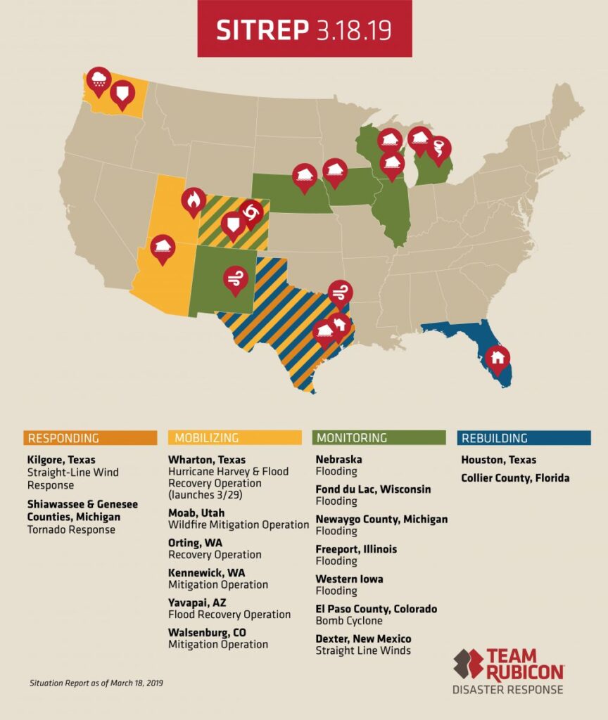
A 2019 example of a SitRep
At the onset of our response, our design team used the generic medical disaster icon—a white cross on a red background—to represent all of our COVID-19 responses. However, it became quickly apparent that this wasn’t going to be the most accurate representation of what Team Rubicon was doing in response to the pandemic.
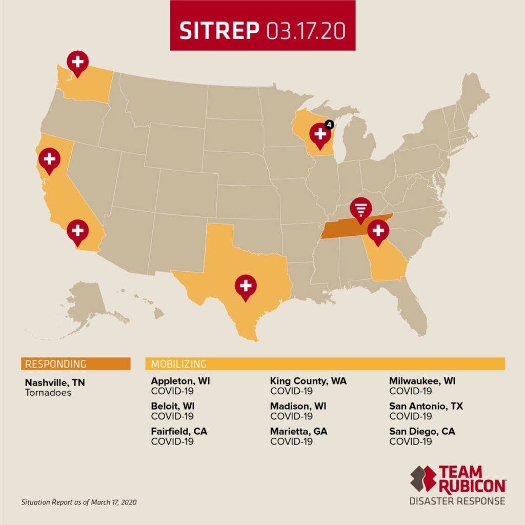
Our first COVID-19 SitRep featured the industry-standard white cross on a red background.
Icons should provide immediate clarity
While a medical symbol represented our hospital support efforts, feeding services are critical to health and well-being, yet they aren’t medical responses. We decided the icon should, instead, represent what we were actively responding to. The next week we changed the icon to denote a COVID-19 response.
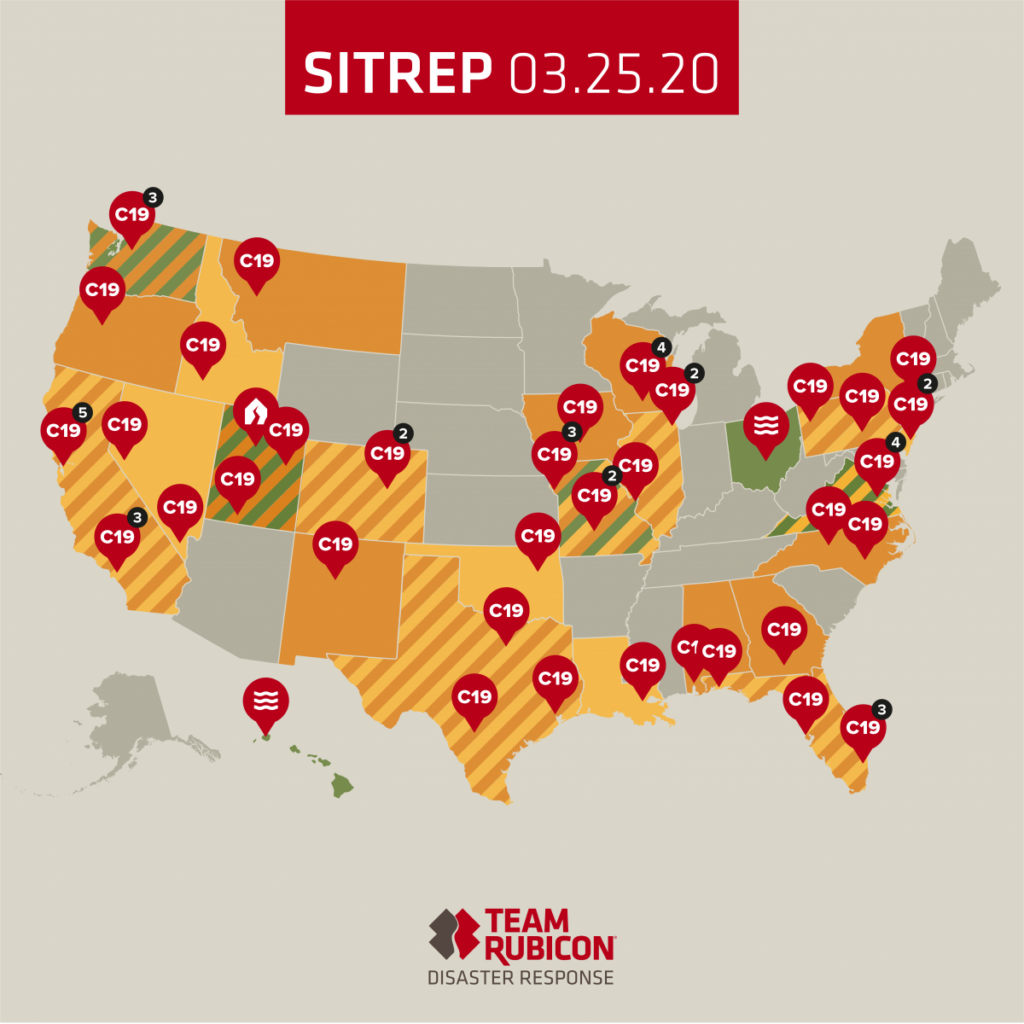
First use of the C19 icon
As our responses grew at a rapid pace and the classification of those responses also shifted quickly, this was the best solution at that time. We pivoted and adapted to this new environment as quickly as we could.
PIVOTING TO MEET SCOPE
Reviewing the in-depth summaries from our Field Operations Team on our, literally, hundreds of operations, it became clear that the “C19” icons were not specific enough. Remodeling our operations after the FEMA Community Lifelines, we were better serving these at-risk communities, and I needed to find a way to visualize that.
Our response to COVID-19 is currently providing food support services, emergency management support, and medical care and testing, nationwide. I first created these icons so that they could be immediately implemented on the SitRep and tell our visual story more accurately. However, if there were two or more different kinds of responses in a given city, we continued to use the more general “C19” icon.
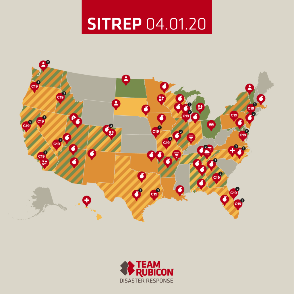
As more unique operations were launched, the flexibility and clarity of the icons became paramount for success.
From here, the icons needed to expand to represent the categories of our #NeighborsHelpingNeighbors initiative. From this, I developed icons like neighbor check-in and transportation. We also developed more general pandemic concepts like physical distancing, handwashing, and PPE to provide assets to the various safety manuals our Capabilities team developed for our volunteers.
The result is that we are now able to provide the most accurate visual depiction of the COVID-19 crisis and our response, which leads us here–to the release of our 15-icon series. While these icons have helped streamline Team Rubicon’s communications during the pandemic, it will require greater collaboration and work across all communities and responding agencies to beat COVID-19. I hope that anyone who is developing creative solutions in the fight against the coronavirus can use these icons.
![]()
As a designer in a global pandemic environment, I learned that adaptability is vital. There is always a better way to communicate, and it’s my job to reach for that perpetually. Although everything seems different now, it remains that the most important thing I can do is always strive to be better. These icons represent that journey and will hopefully help in yours.
Download our COVID-19 icon set here.
To support Team Rubicon’s ongoing coronavirus response efforts, please donate today.


